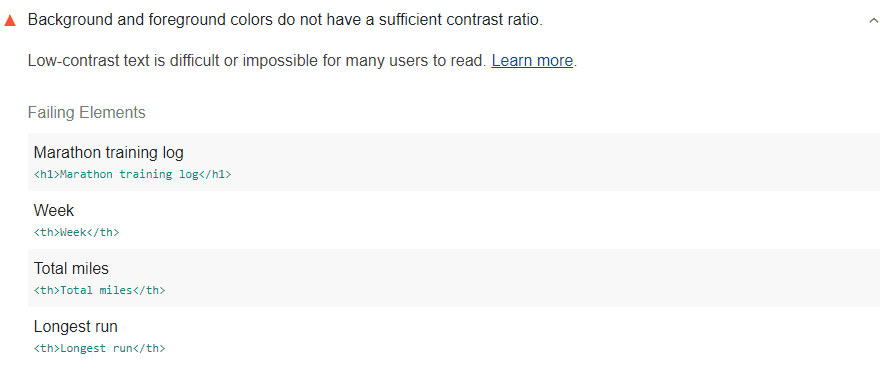
Lighthouse scans the content on each page on your website and flags the parts with a low contrast ratio as a result of this scan. You can actively monitor your site thanks to Lighthouse and view notifications about points where you do not have a sufficient contrast ratio. Of course, the system you use must have a very powerful visual evaluation software for this. Lighthouse uses criterion 1.4.3 from WCAG 2.1 for accurate evaluation and detailed analysis. According to this system;

- A text with 18 points or 14 points and bold should take a value like 3: 1 as a contrast ratio.
- The required value for all other texts in this regard is determined as 4.5: 1.
While analyzing your page, Lighthouse may not be able to analyze the text content superimposed on an image. Because the audit system works effectively only for contents that are directly entered as text.
Did you know that?
According to WCAG version 2.1, the system now covers user interface elements and images in color contrast requirements. Lighthouse does not provide this service as an extra, but we recommend that you manually perform this check to make sure your entire site is 100 percent user-friendly, including user interface elements and images.
Does your website have a sufficient color contrast ratio?
We learned the answer to the question of what is the color contrast ratio. This time, we will take a look at whether you will adequately realize this factor, which is shown among the ways to increase user experience on the website.
It is extremely important that you comply with the most basic requirements set by the WCAG system, make sure that the rates just mentioned are provided to your website. Remember:
- 3: 1 ratio for 18 point texts,
- 3: 1 ratio for 14 point and bold content
- 4.5: 1 ratio for all other content
Using Chrome DevTools, you can easily get the color that will keep the content on your website in line with the required basic contrast ratios. For this, you may be asking the question of how to use Chrome DevTools. Here are the basic steps to do this:
- First of all, right-click on the image you want to check. If you’re using a Mac, you can click the Command key.
- Then click on the Inspect option.
- Click the Styles option that comes up and chooses Elements.
- Then choose the color value from the options that appear.
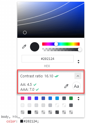
You need to click on the color thumbnail located right next to Value. In this way, you will examine the color transitions in the thumbnail that will appear and you will be able to choose colors with the color picker tool in a short time. Under each hue, you will find the contrast ratio of the color you choose along with your current color.

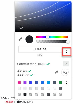
Manually selecting the color over the thumbnail can be really tiring sometimes. Therefore, you can use the up and down arrows next to the color code to increase and decrease the tone of the color. You will see that the contrast ratio is reconstructed with slight differences. This is also a very good way to have a point-to-point ratio.

The process of deciding on color value can be completed in this way. The next thing you need to do is upgrade your project to CSS.
For a maximized user experience model on your website, it may be necessary to check not only images but also more complex areas over gradients. For example, Google DevTools is also very useful to correctly adjust the color contrast of a text on an image. You can also use the color picker thumbnail system to choose the background that will appear behind the text. When making a selection for this, contrast ratio information will be given to you automatically at the bottom.
