What is an Infographic?
In the most general terms, an infographic is a means of communication aimed in the visual context. In other words, infographics can be explained as the visual representation of a given data or any sort of information. There can be many reasons to use infographics in a specific domain, and infographics have different kinds as well.
The use of infographics in various areas is becoming more and more popular, especially in the marketing field. The expanded use of infographics raises more questions about it every day regarding what an infographic is and what areas it can be used. In fact, the questions about the infographic can go as the details of those areas comes into the equation. In this article, you can find detailed information about various aspects of infographics.
Infographics: A detailed look
When looked at the word “infographic,” we can see that it consists of the words “information” and “graphic.” The central concept behind an infographic is to deliver the information or the data that a person wants to deliver in a more understandable and attractive way that would increase the attention. When it comes to delivering a message to a less-knowledgeable audience, and big words meet with complex data, using infographics is one of the most preferred methods to create a more meaningful message.
An example can be given from posters in schools. Most of the time, posters are used to explain a situation to children in a way that they can understand. For first-graders, it can be very challenging to understand and make sense of words such as carbon emission and global warming. Infographics can be perfect for this situation; a well-prepared infographic can deliver the meant message to a younger audience with visuals, colors, diagrams, and correct word use.
Why is an infographic useful?
One way to understand the use of an infographic would be to evaluate why an infographic is helpful. There can be many ways of delivering a message, and you should be aware of the facts that make an infographic different from other methods to fully comprehend what the idea behind an infographic is. The following are the things that make an infographic useful.
Pattern detection
One thing that the human brain is really good at is pattern detection. In a visual context, it is straightforward to create patterns that would help people to understand what is going on and what the message is. Think about the diagrams and sequences in infographics. They are all optimized for pattern detection to give an idea to people just by looking at them. Looking at such patterns would be so much easier than reading a long text full of complicated words and terms.
Explore More: UX and SEO: How Can Site Design Affects Your Ranking?
Another thing to mention here is that people tend to scan texts in a sequential manner. This means that when we are presented with a text, we are reading it one word at a time, but an infographic can do much more than this. There can be words in different places in an infographic, meaning that people will be able to grasp different words in different places in the visual without giving so much effort.
Scanning time
An important feature that makes an infographic useful is the scanning time individuals have when they are presented with information or data. Typically, individuals do not spend too much time on the things they see for the first time if there is nothing special about it. Think about the human resources teams. Did you know that they spend an average of 5 to 7 seconds while they are looking at your cv? Individuals also tend to spend a short time when they are looking for data, a table, or any sort of information.
With an infographic, a crystal-clear message that would attract attention can be easily created. An infographic can be created in a way that people will understand and process the message meant to be given on such short notice. Of course, there are some details that make an infographic good when it comes to delivering clear messages in a short amount of time, which will be discussed in the following sections.
Colors and design
It is no secret that colors and design in any given visual context play a big role when it comes to delivering a message. Colors and design have meanings; they tell us something about the message. They can be very useful tools that make infographics a great means of communication. With the right colors and design, an infographic can tell a lot of things without crowded words or data sets.
Types of Infographics
As mentioned earlier, there are different kinds of infographics since there are a great variety of domains used in making them. There are three main types of infographics, but keep in mind that they all have subcategories, but the three main types are the general ones. The following are the three main categories of infographics:
- Information Design
- Editorial Infographics
- Data Visualization
Each type of infographic serves for a different reason and can be used in many contexts. If they are used in the right manner, they can all create wonders.
Information Design Infographics
The first type of infographics that we will mention is information design infographics. In fact, information design infographics are also related to graphic design. As mentioned earlier, there is a design part of infographics that plays a big role in it. In graphic design, information design aims to illustrate information in the most efficient way possible. The way of making information efficient can be different in different contexts, and context should always be taken into consideration. It is not a surprise that information design is a huge subcategory that includes many disciplines. The following are some uses of information design infographics:

- Process: Information design infographics can be a great tool to describe a process. When a process is presented in visuals with a sequence, it would be easier to understand the meaning behind the process. Think about the steps of the scientific research process. There are many steps that should be in a specific sequence, and it can be difficult to memorize the steps. A process infographic can be very useful, and it is commonly used in textbooks as well.
- Anatomy: Anatomy infographics are one of the most commonly used infographic types among brands. When brands want to tell people about what they have in their products, it is a wonderful method to use anatomy infographics. Anatomy infographics can be created in many ways, and they tend to describe what is in a product (or human in terms of medicine).
- Hierarchy: Hierarchy infographics are used to define different levels of the data or information you might want to show. Think about how Maslow’s Hierarchy of Needs
- Timelines: Timelines in an infographic format can be much better than when it is presented as a text. It can be very useful to give a chronological order in the form of infographics. You can illustrate the important events of 2021, the ten-year economy plan of your business, or visually presenting the history of a brand.
Editorial Infographics
Editorial infographics are a type of infographic that uses the methods of creating an infographic to tell a story. A message that is wanted to be given to the readers can be best presented to them by making it a narrative. Nowadays, brands take advantage of editorial infographics more than ever since they have a great potential for distribution. It is very easy for a well-prepared editorial infographic to go viral on the internet, but it is crucial that people will understand the message.
A thing to note is that there should not be a reference to your brand or company in an editorial infographic. Because what matters in an editorial infographic is to deliver a message while keeping people’s attention alive. When the reference to your brand comes into the equation, it would be pretty easy to bore people and lose their attention. Instead, it would be the wisest option to implement a small logo of your company or brand just to notify people about the source of the infographic. It would be a better option to raise brand awareness or increase the traffic on your website, whatever your goal is.
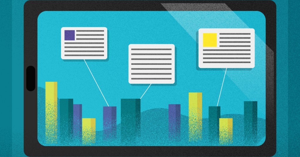
Data Visualization Infographics
Using charts and graphs to illustrate a data set or multiple data sets is not something new, but data visualization infographics are a little bit more than that. Indeed, data visualization uses graphs and charts to visually represent data, but graphic design is also in the equation. It might be challenging for people to understand the meaning behind numbers, significant differences between two points, or the shift in between years by only looking at numbers. With a data visualization infographic, a message can be given in a much easier and efficient way.
Additionally, data does not always have to be in the form of numbers. Shapes, colors, and sizes can tell a different story about non-numerical data to people. The data must easily make sense to people who look at the infographic, and they must be able to tell what is going on in the infographic easily to others.
Infographic Design Styles
Infographics are never just about delivering information and make sense of the data. As mentioned earlier, an infographic aims to deliver information or data in the most efficient way possible. The efficiency of an infographic is highly related to the design style used. When graphic design is included, there are thousands of ways to create a design, if not millions. However, there are three main infographic design styles that are predominantly used in today’s era.
Static Infographic Design
As you can infer from the name, static infographic designs are in the form of a picture. There is nothing moves, or you cannot interact with it; there is just a nicely implemented message. It is the simplest infographic design to create, and you have probably seen thousands of them in your lifetime. Static infographic design can be very helpful to strengthen the narrative in a given text context. You can support your idea by visualizing some of the most important points. Keeping a static infographic design interesting is crucial to keep the readers’ attention.
Animated Infographic Design
The following infographic design style is animated infographic design. Animated infographics are animated, as you can guess. You might be familiar with animated infographics in the form of gifs. If your goal is to keep the attention of the readers as alive as possible, choosing an animated infographic design can be a good idea. Additionally, with animated infographics, you can nicely implement a tutorial or a cause-effect relationship that you want to give as a message. It is also a great tool to illustrate changes in any given context.
Interactive Infographic Design
Making your readers or clients interact with your content is easier than ever with interactive infographic design. The viewer would need to have a kind of action to be able to activate the infographic in a different way. The best use of interactive infographic design would be to create a navigable experience in a website. It is a wonderful method to actively engage with the viewers without effort and enhance the user experience they will get as a result.
With interactive infographic design, your viewers will not only need to read or watch content, but they will become a part of the experience themselves (which most people love doing so). It is also much easier to make sense of an interactive infographic when it is compared to other designs since people tend to understand and remember the experiences when compared to reading a text and seeing the content.
Designs can look alike even though they were meant to be unique and one of a kind while it was being designed; there are just too many of them. Another wonderful thing about interactive infographic designs is that the chances of it being similar to another interactive infographic design are pretty low. It will be telling your story, and you can navigate people in any way you want in an interactive infographic.
What makes an infographic a good one?
After learning the details about what an infographic is, it would be best to see what makes an infographic a good one to evaluate the needs of your content. As mentioned earlier, a good infographic can make your content ten times better, but a poorly prepared one can be both time-consuming and a waste of money. Because of this, you would not want to waste any valuable time or money. The following are the things that make an infographic good, and it might be sensible to take those into consideration while you are planning to create an infographic for any reason.
Know your audience
In order to create an effective and informing infographic, you should first know your audience well. Not every infographic would be compelling on different kinds of people. You should be knowledgeable about your target audience’s interests and what kind of designs they like. Of course, not every people in your target audience will like precisely the same thing, but you can estimate the possible results according to the average. It is crucial to optimize the number of people interested in your infographic and understand what is going on there.
Know your brand image
If you have a brand, it is also crucial to know what your brand image is. The word “brand” here does not necessarily be a famous brand that is well-known for its products. Your blog is your brand, your small business is your brand, and your website is your brand. You should be knowledgeable about what kind of an image you want to put out there regarding your brand. Do you want to let people know you are representing a higher socioeconomic class with niche needs? You would not want to use colors and designs that are not representative of them.
For example, you might be familiar with the “minimalism” trend on high-end brands. The minimalist brand image seems to be working for high-end brands when all the consumer psychology and the idea behind designs are considered. Your infographic can be representative of your brand image by following the latest trends and consumer behavior. It is crucial to fit in a specific brand image and not just wander out and try different stuff each time you create something.
Brainstorm for the optimal results
Great ideas do not come up all of a sudden. They might sometimes, but optimized and effective infographics need time and effort. You need to think before you take action for your infographic. There are many things to consider, and to come up with a good infographic; you need to consider many of those things. Here are some of the things that you can consider while brainstorming for your infographic:
- New trends on the media relevant to your domain
- Upcoming events
- Your company’s data
- Previous content
- Credible sources
- Keywords
- Inspiration
- Materials
Using credible data sources
Infographics are not all about looking nice and attracting attention. Even though they comprise a big part of infographics, the information in it is the other half of an infographic that makes it a good one. When you are presenting data in the form of an infographic, you would not want to notify your audience with wrong information. Presenting wrong information to your audience might decrease the brand image in the worst possible way, and your viewers might lose trust in you.
You should always be careful about what is the source of the information you are giving on your infographic. Have you seen it on a Facebook group, or was it taken from a peer-reviewed academic article? It is also essential to implement this credible reference on your infographic in a way that would make sense to the public concerning your target audience. Not all target audiences are full of scholars, so you will need to be able to tell a story with your data.
Get inspired
Your infographic has to be unique; this is an unwritten rule. But the thing is, there is nothing wrong with getting inspired by a good infographic. You can take a look at others’ work to have an idea about what a good infographic looks like and what the details are that you need to be aware of while creating your own. You can get inspired by similar content creators regarding your brand and take notes about what makes them successful.
Promote smarter
Once you are done with creating a unique and effective infographic, you will need to promote it. Advertising is one option, but you still need to be wise about your advertisement since being seen in the wrong contexts will not be useful for you. Another thing you can do to promote your infographic would be to create an SEO-optimized one. Increasing the organic traffic on your website is probably one of your main priorities, and it is possible by creating SEO-optimized infographics. There are many things to consider while creating an SEO-optimized infographic. Here are some of the most important things to keep in mind when making your infographic SEO optimized:
- Choose an optimization keyword: Like in all SEO content, focusing on an optimization keyword would be one of the best methods to increase original traffic on your website and reach a larger audience. You should choose your keyword wisely and think about what people will search on the internet that is related to your infographic. You can add your keyword to your headline, URL, meta description, image filenames, image alt text, and H1 headings to maximize SEO quality.
- Be careful about the load time: Another thing to consider while optimizing your infographic is to be careful about the load time. You should always check how long does it take for your infographics to be loaded on your website. If it takes too much time to load, this means that the chances of Google putting your content on the top of search results will be pretty low.